Strategy & Execution
We began by defining the brand's positioning, audience segments, emotional drivers, and category whitespace. Oud became the organizing principle: a symbol of rarity, ritual, memory, and craftsmanship.
From there, we developed messaging pillars and storytelling guidance for product pages, launch campaigns, social content, and in-store moments.
Visual Identity
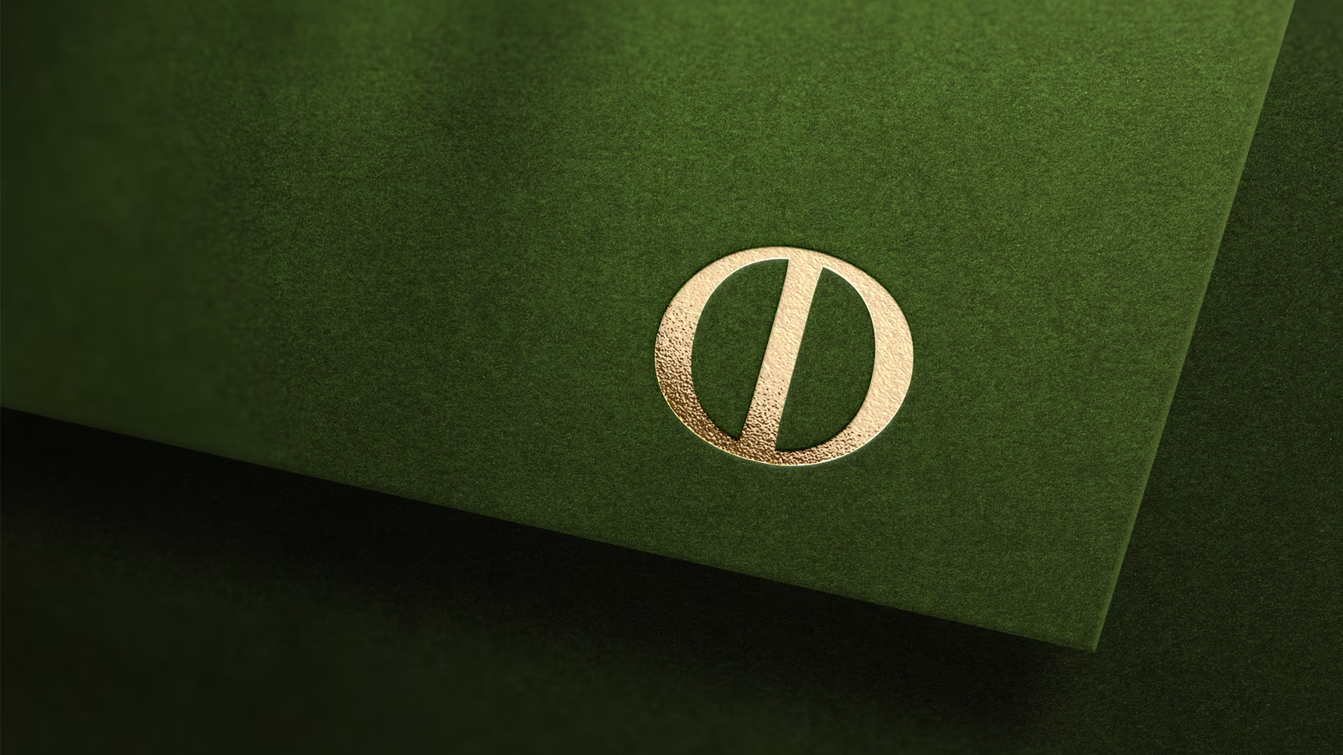
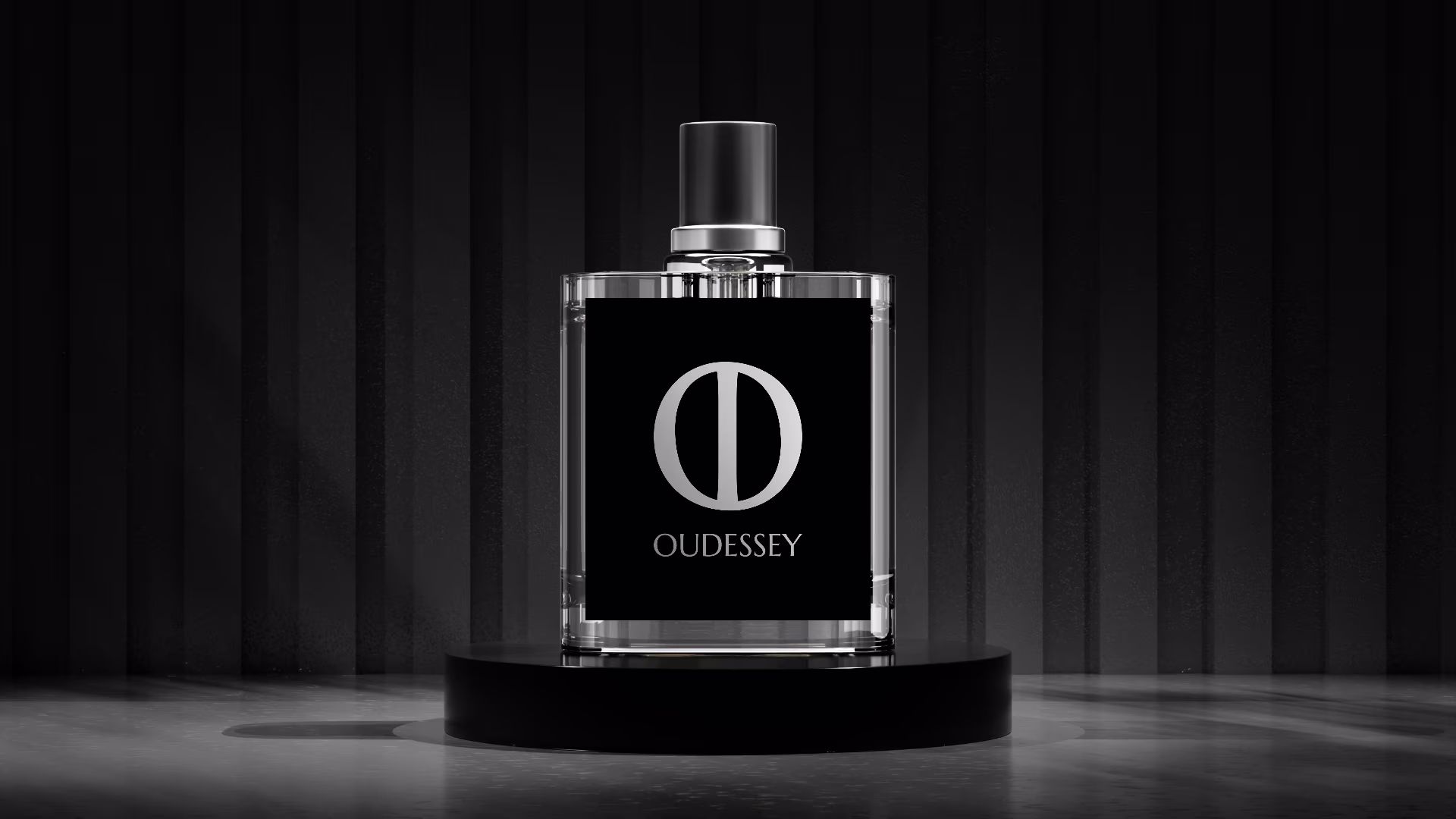
The visual identity was built around a restrained monogram that gives Oudessey a distinctive and ownable mark. It reads as minimal and editorial, while carrying a direct connection to the oud tree and the natural source behind the fragrance.
The vertical form at the center represents the trunk of the oud tree, grounding the mark in origin, strength, and material structure. The outer oval form references the oud fruit, while the split through the composition reflects the moment when the fruit is fully ripe and its outer leathery shell cracks open into two halves.
The wider identity system covered wordmark usage, typographic hierarchy, color direction, composition, and art direction, creating a visual language that feels elevated, disciplined, and distinctive.
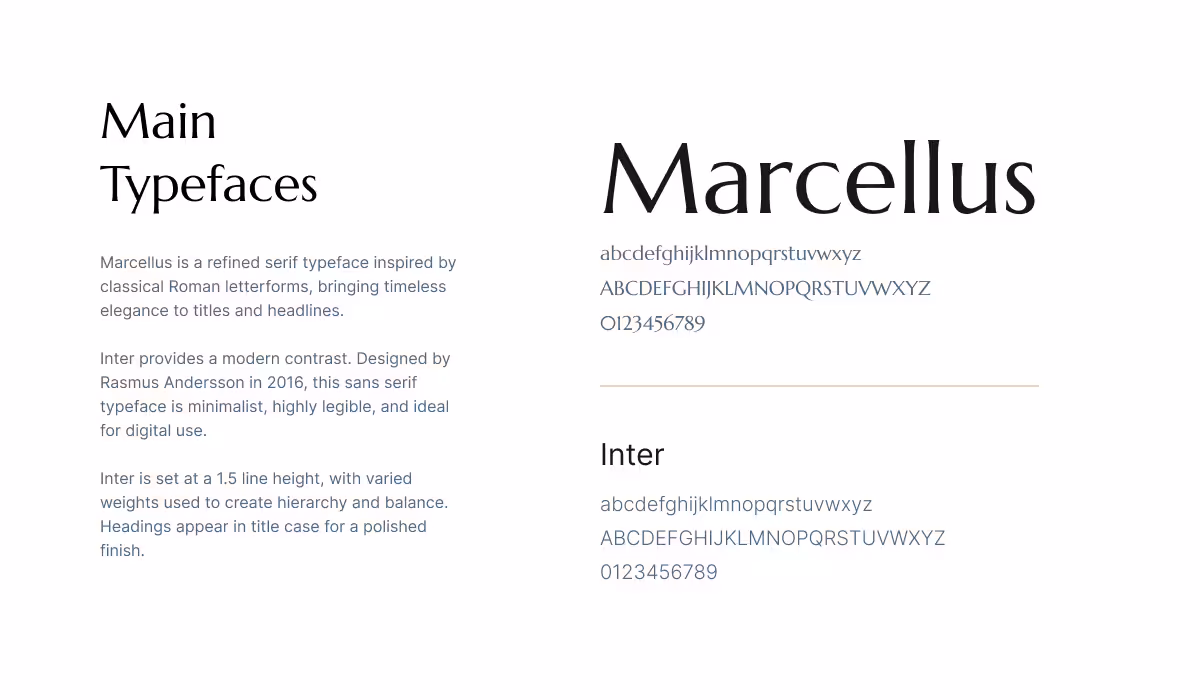
Typography
The typographic system reflects the brand's duality: heritage and modernity, emotion and precision. Marcellus brings ceremony and permanence to product naming and brand signatures, while Inter keeps ecommerce, packaging details, and campaign communications clear.
Together, the two typefaces create a system that feels expressive without becoming ornamental, and polished without feeling generic.
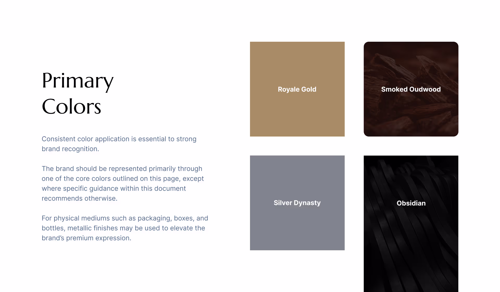
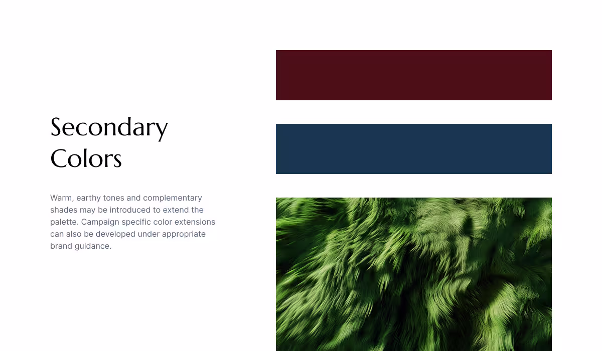
Color Palette
The palette was built around richness, contrast, and material depth. Royale Gold signals prestige, Smoked Oudwood anchors the system in warmth, Silver Dynasty adds polish, and Obsidian provides intensity and contrast.
The secondary palette expands the emotional range of the brand. Crimson Reserve brings warmth and sensuality, Midnight Blue adds sophistication, and Velour Green references agarwood's natural origin.
Packaging Direction
The packaging direction translated the brand strategy into a tangible luxury experience. Color, typography, material cues, and composition were aligned to create a product presentation that felt considered, collectible, and commercially credible.
The design avoids excessive ornamentation, relying on proportion, contrast, finish, and restraint to communicate value across shelf display, ecommerce imagery, unboxing, and campaign content.
Rollout
The final delivery included a practical brand playbook that gives the team a clear operating system for launching new collections faster while maintaining consistency across every customer-facing touchpoint and future growth channel.